Covid dashboard live
https://data.dancron.in/covid-gb/
Yes, it’s another lockdown project. Consume at your own risk and protect yourself at all times!

I was inspired by The Guardian’s data journalists, and kept their colour scheme.
The app reads data from the GOV.UK Coronavirus API, stores it in an Amazon service and displays it using Esri’s JS API.
It’s designed to answer two questions:
-
Is the rate of COVID detection in my area high or low, compared to other places?
-
Is the change in the rate of cases good or bad compared, to other areas?
How does it work?
You can either browse the map to get a general sense of cases across England and Wales, or use the Local Authority search tool to get details about your local area.

The app uses Lower Tier Local Authorities (LTLAs) and includes all of the LTLA data being published at the time of writing.
Icons at the top left are,
- Go home
- Toggle case rate / case change
- Link to this blog
Mobile users will want to toggle the legend button (bottom right).

Design
There are a few differences between this app and TG’s map, some obvious, some less so.
Cartogram
Cartograms use regular shapes (often hexagons, triangles or squares) to represent territories such as countries, states or counties. They are particularly useful for mapping human-focused information. When using real administrative boundaries, as in TG’s map, sparsely-populated rural areas carry more visual weight compared to urban population centres. Cartograms can go some way to address this and present an even picture of the underlying information.
I’ve used hexagons to represent each lower-tier local authority (LTLAs), whereas TG use the actual boundaries of the upper-tier local authorities (UTLAs).
My primary reason for this choice is that Ben Flanagan of Esri UK already created a hexagons based on 2017’s boundaries :^)
Data classification
TG chose to show the week-on-week local change as a percentage. I think this is a fair choice in order to make the information as clear as possible, but it comes with some shortcomings.
Firstly, when viewed through the lens of local authorities, cases of coronavirus are not equal. Detection of one case in Birmingham, population 1,000,000, is not of equal concern to detection of one case in Orkney, population 20,000. The risks to the infected individuals are equal, but the proportion of infected people in Orkney is greater.
Secondly, when we consider percentages of raw case numbers, we lose a lot of information about the magnitude of the problem. To continue with the examples above, if Birmingham’s detections increased from one to two, that would be a case rate increase of 0.0001% in the population of one million. If Orkney increased from 10 to 20 detections, that would be a case rate increase of 0.05% in the population of 20k. For the purposes of TG’s map, both are local increases of 100% - even though the hypothetical situation in Orkney is 500 times worse.
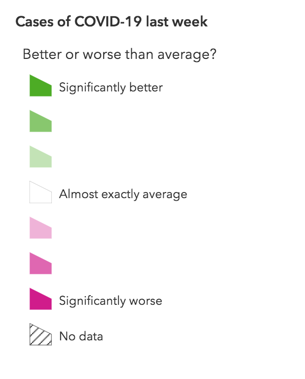
I have bravely avoided the problem of communicating this by not quantifying the legend at all - it just says better or worse, which is probably too vague for a mainstream news outlet. The underlying classifications I’ve used are based on standard deviations from the average. Places with the most intense green or pink colours are over two standard deviations away from the average case rate, or the average rate of change.
Presenting this information in a way which is accurate, accessible and transparent is challenging and I hope that I’ve made sensible compromises.
Caveats
Scotland
Firstly, apologies to Scotland. The UK Gov API does not include Scottish data at the local level. I make no political comment here.
Magnitude
My cartographic choices don’t capture far outliers, although you can see specific details in the pop ups.

As cases hopefully approach zero, they become very difficult to meaningfully visualise (a good problem to have). I’m sure others can point out statistical weaknesses, and I’m open to feedback.
The legend
I have used the term ‘Significant’ loosely - I have not tested for statistical significance.
Known issues
- The JavaScript API used for display generalises the hexagons, leaving them irregular. Once seen, never unseen. I’m sure there is a way to override this, somehow…
- The latest result’s date is not always consistent across local authorities. I’m using the latest results available, at the expense of consistency in some cases.
- Some issues with retrieval of information for individual LTLAs
Thanks and stay safe.